Web Design & Branding
Nonprofit Association of Oregon

Design Director: Sitemap, Wireframes, Branding, Creative Direction, and User Interface
Lead Designer: Branding and Creative Direction
A Radish Lab Project
Role & Responsibilities
The Nonprofit Association of Oregon (NAO) is a statewide nonprofit membership organization representing and supporting nonprofits of all sizes and missions across Oregon. Feeling like there was a major disconnect from the community-centered work they do and their visual identity and public-facing messaging, they wanted to tackle a full rebrand and website overhaul in tandem.
A Brand New Brand

An Ode to Oregon
The Problem: The existing NAO brand was very limited–just white, gray, black and yellow–and the team did not feel it fit with who they are, the work they do, and the community they serve. The NAO team is also incredibly small, and because the nature of their work does not lend itself to having photography they also knew they’d need to rely on stock as a primary source of visuals for the new website and any other branded materials.
The Solution: Drawing color inspiration from Oregon's diverse landscapes—deep forest greens, coastal blues, and desert yellows and ambers—the brand evolved with bold gradient combinations using spot gradients rather than linear ones, symbolizing distinct communities interacting in unified spaces that reflect NAO's community engagement work. These vibrant colors are balanced with soft neutrals, and all combinations were designed to meet WCAG AA accessibility standards with thorough documentation to help NAO's small team easily produce accessible assets. To complement the rich palette, their typography system incorporated two fonts that balance playful and serious tones, reflecting both NAO's industry-leading expertise and their warm, inviting personality. Mala–a quirky serif that reads well big and bold for headlines, and Campaign–a robust, highly legible sans serif family that has a little bit of a quirk to the character shapes. Together they’re a fun pair with great contrast and complementary character shapes, producing a strong type system.

A Brand New Logo
A new era of NAO
The Problem: NAO’s original logo was hard to work with, and lacked a connection to who they are–a key stakeholder felt it looked like someone saw sticky notes on a desk and decided to ship it as their brand. The new logo needed to be more intentional, flexible and usable.
The Solution: During workshops and strategy conversations with the NAO team, we focused on discussing what parts of their work are most important for their brand to visualize. Community, Communication, Dialogue, Connection, and Engagement were all constants regardless of the part of the process.
The final design landed on a contemporary aesthetic that conceptually connects to NAO's community-focused work, with logo segments housed in overlapping chat bubbles that evoke conversation while mirroring a cornerstone shape. The modular logo system provides flexibility with both full name and acronym versions, ensuring NAO always has the right mark for each application.
A New and Improved Website

Organization and easy of exploration
The Problem: As a membership-based organization, resources are a huge part of NAO’s offerings. The previous site did not fully showcase the breadth and quality of their resources, made it challenging for non-Members to understand the benefits of becoming a member, and limited the internal team’s ability to update and expand the site as they grew and produced more content.
The Solution: To ensure a seamless user experience for both newcomers and returning members, the new site features sweeping improvements to information architecture, horizontal navigation, taxonomies, and breakpoints while centering users at every level of the experience.


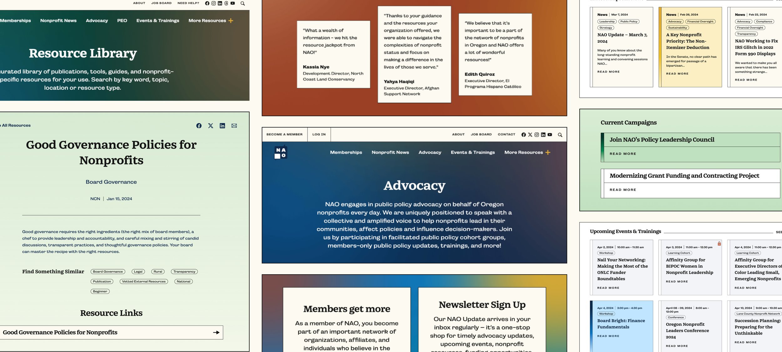
As Design Director I oversaw the entire design process from workshops to final quality assurance, led brand design and was hands-on during the robust user experience and user interface phases of the website project.
Design Direction of: Sitemap, Wireframes, Branding, User Interface, Quality Assurance
In my capacity as Design Director, I’m responsible for writing and managing. the production of all case studies. To read more about the process for this project, check out the official Radish Lab case study on Web here, and Brand here.

Explore More
-
![]()
Denver Preschool Program
Design Direction & Brand Refresh
Design Director | A Radish Lab Project
Website Design, Branding -
![]()
MenCare
Design Direction & Branding
Design Director | A Radish Lab Project
Website Design, Branding -
![]()
Nonprofit Association of Oregon
Design Direction & Branding
Design Director | A Radish Lab Project
Website Design, Branding -
![]()
California Certified Organic Farmers
Design Direction & Refreshed Branding
Design Director | A Radish Lab Project
Website Design, Branding -
![]()
Reimagine Public Health
Campaign Design & Strategy
Lead Designer
Campaign Design, Strategy, Branding, Animation, Website Design -
![]()
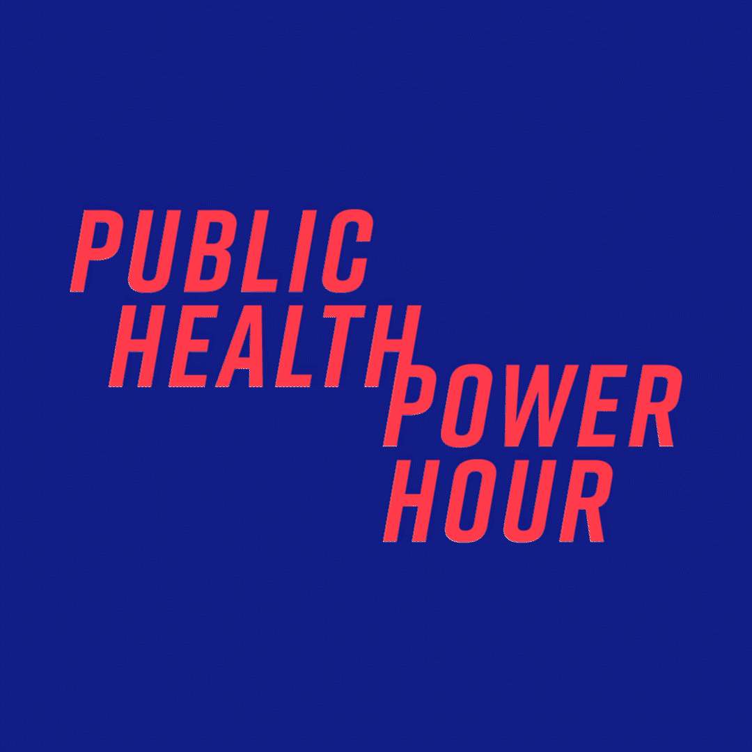
Public Health Power Hour
Brand Design & Animation
Lead Designer
Branding, Animation, Social -
![]()
Rise + Vote
Campaign Design
Lead Designer
Campaign Design, Branding -
![]()
Marshall Plan for Moms
Campaign Design & New York Times/Washington Post Ads
Lead Designer
Campaign Design -
![]()
HLW
Design Direction
Design Director | A Radish Lab Project
Website Design -
![]()
New York Community Trust
Design Direction
Design Director | A Radish Lab Project
Website Design -
![]()
Community Change Action
Design Direction
Design Director | A Radish Lab Project
Website Design -
![]()
Olmsted Parks Conservancy
Design Direction & Refreshed Branding
Design Director | A Radish Lab Project
Website Design, Branding