Web Design & Branding
MenCare

Design Director: Branding, Creative Direction, and User Interface
Lead Designer: Branding and Creative Direction
A Radish Lab Project
Role & Responsibilities
MenCare, an organization focused on promoting healthy masculinity from the lens of fatherhood, needed a visual revamp to match the power of the work they’re doing in the real world.
A Refreshed Brand
Finding a distinct voice in a wider brand family

The Context: MenCare is a campaign initiative that has it’s own content, research and website but is officially part of their parent brand Equimundo’s portfolio umbrella. Part of a wider strategic alignment with Equimundo, the rebrand was a key milestone in the main organizations wider 5-year plan to ensure their brand portfolio is both representative of the wider gender-norms conversation while remaining distinctive to the primary objective each sub-brand has. With the strategic conversations in mind,
The Problem: MenCare’s existing brand was muted and very simple, and didn’t truly capture the energy and importance of the work the organization does in the global gender equity community. And because they’re part of a wider brand umbrella, their brand needed to be both distinctly and uniquely them while also playing well with Equmindo and their other sub-brands.
The Solution: MenCare’s rebrand and new website centered around the idea of vibrant masculinity – finding the balance between bold, strong colors and font choices with the whimsy of childhood brought forward through side-walk chalk accents. The rich dark blue and. bright yellow are pulled from Equimundo’s brand to create a visual tie between the brands. For the logo, opting for a strong, clean type based mark felt right and the softened curves and lowercase characters mimic qualities of Equimundo’s logo to further the subtle visual connections between the two brands.

A Website Redesign
A new & improved, accessible experience

The Context: The MenCare team had a major event coming up that put a clock on applying the new brand to their small existing website. Because Radish Lab was already managing the MenCare website, the process skipped over all User Experience phases of a website design project.
The Problem: While their site was small, it was densely packed with long form text blocks and hard to find resources. The new site needed to match the existing sitemap 1:1 and ideally not require the MenCare team to rewrite or produce new content. The site was also lacking WCAG accessibility compliance, which is a priority moving into an updated experience.
The Solution: The main focus for the website was to prioritize better information hierarchy and content strategy utilizing MenCare’s existing content. Breaking up large walls of text into multiple modules, allowing for larger statements and text hierarchy. The new brand was designed with accessibility compliance in mind, so in UI that focus was on other elements that contribute to WCAG compliance like hover states and line length. The final product is bold and vibrant, featuring the human elements of their brand while also making the content easier for users to read, engage with and explore.
In my capacity as Design Director, I’m responsible for writing and managing. the production of all case studies. To read more about the process for this project, check out the official Radish Lab case study here.
Explore More
-
![]()
Denver Preschool Program
Design Direction & Brand Refresh
Design Director | A Radish Lab Project
Website Design, Branding -
![]()
Nonprofit Association of Oregon
Design Direction & Branding
Design Director | A Radish Lab Project
Website Design, Branding -
![]()
California Certified Organic Farmers
Design Direction & Refreshed Branding
Design Director | A Radish Lab Project
Website Design, Branding -
![]()
Reimagine Public Health
Campaign Design & Strategy
Lead Designer
Campaign Design, Strategy, Branding, Animation, Website Design -
![]()
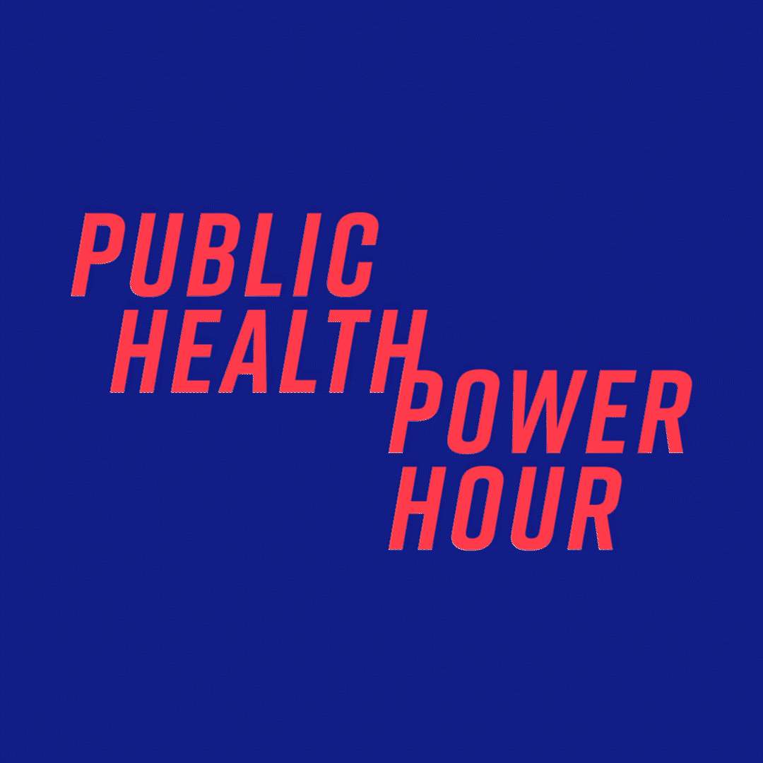
Public Health Power Hour
Brand Design & Animation
Lead Designer
Branding, Animation, Social -
![]()
Rise + Vote
Campaign Design
Lead Designer
Campaign Design, Branding -
![]()
Marshall Plan for Moms
Campaign Design & New York Times/Washington Post Ads
Lead Designer
Campaign Design -
![]()
HLW
Design Direction
Design Director | A Radish Lab Project
Website Design -
![]()
New York Community Trust
Design Direction
Design Director | A Radish Lab Project
Website Design -
![]()
Community Change Action
Design Direction
Design Director | A Radish Lab Project
Website Design -
![]()
Olmsted Parks Conservancy
Design Direction & Refreshed Branding
Design Director | A Radish Lab Project
Website Design, Branding