Web Design & Branding

Denver Preschool Program
Design Director: Sitemap, Wireframes, Branding, Creative Direction, and User Interface
Lead Designer: Branding and Creative Direction
A Radish Lab Project
Role & Responsibilities
Finalist in 2025 PR Daily’s Social Media & Digital Awards
Awards & Recognitions
The Denver Preschool Program is a nonprofit based in Denver, Colorado helping to provide access to affordable preschool for all families. They’d outgrown both their brand and website, neither was serving their organizational goals or fully representing their vision for the future.
A Refreshed Brand
Balancing whimsy & function

The Problem: At the start of the project, work the DPP team was producing had already started to stray from their brand guidelines, especially around color usage. While the tones stayed within their primary-color color scheme, newer branded materials had started to stray outside the official brand guide. The original palette lacked the bright, vibrant energy that the team brought to their work–it didn’t feel like the brand for an organization centered around children and learning–and also had some significant accessibility concerns.
The Solution: Staying within their original primary colors color scheme, the new brand amps up the vibrancy bringing more of the pre-K fun and playfulness into their identity. Playful layered buttons that look like liThe refreshed palette prioritizes WCAG Accessibility Compliance to ensure that their new brand and website are meeting all necessary standards for users with impairments so that all users can navigate their content.


A User-Focused Experience
Strategic, audience-informed design

The Problem: The current site had expanded in many directions as the organization grew and evolved over the last few years, resulting in a site structure and navigation that made it challenging to know where to look for key information. User feedback consistently highlighted navigational challenges, density of information and an overall confusion on how to find basic information about DPP’s programs and eligibility rules.
The Solution: At the site navigation level, by focusing on the two audience buckets that all DPP users can be sorted into–Families and Providers–the new experience ensured a clear user path for any new or old DPP users to navigate to the information most relevant to them and their needs. From a content and design perspective, redundant information and overly-distributed pages were streamlined into single point of reference pages with clear calls to action throughout the site.
In my capacity as Design Director, I’m responsible for writing and managing. the production of all case studies. To read more about the process for this project, check out the official Radish Lab case study here.

Explore More
-
![]()
Denver Preschool Program
Design Direction & Brand Refresh
Design Director | A Radish Lab Project
Website Design, Branding -
![]()
MenCare
Design Direction & Branding
Design Director | A Radish Lab Project
Website Design, Branding -
![]()
Nonprofit Association of Oregon
Design Direction & Branding
Design Director | A Radish Lab Project
Website Design, Branding -
![]()
California Certified Organic Farmers
Design Direction & Refreshed Branding
Design Director | A Radish Lab Project
Website Design, Branding -
![]()
Reimagine Public Health
Campaign Design & Strategy
Lead Designer
Campaign Design, Strategy, Branding, Animation, Website Design -
![]()
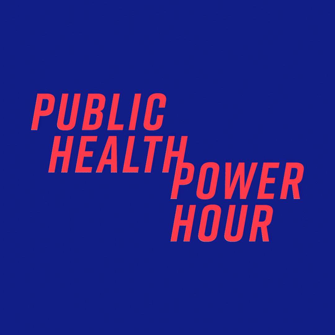
Public Health Power Hour
Brand Design & Animation
Lead Designer
Branding, Animation, Social -
![]()
Rise + Vote
Campaign Design
Lead Designer
Campaign Design, Branding -
![]()
Marshall Plan for Moms
Campaign Design & New York Times/Washington Post Ads
Lead Designer
Campaign Design -
![]()
HLW
Design Direction
Design Director | A Radish Lab Project
Website Design -
![]()
New York Community Trust
Design Direction
Design Director | A Radish Lab Project
Website Design -
![]()
Community Change Action
Design Direction
Design Director | A Radish Lab Project
Website Design -
![]()
Olmsted Parks Conservancy
Design Direction & Refreshed Branding
Design Director | A Radish Lab Project
Website Design, Branding