Web Design & Branding
Boston Athletic Association (BAA)
Design Director: Sitemap, Wireframes, Branding, Creative Direction, and User Interface
Lead Designer: Branding and Creative Direction
Role & Responsibilities
Awards & Recognitions
The Boston Athletic Association (B.A.A.) is the nonprofit organization that puts on the annual Boston Marathon, as well as a handful of other races, events, community run clubs, and other Boston-based running initiatives. They had far outgrown their existing website: internally, the team struggled with an impossible-to-use CMS and lack of development support to make incremental updates, and visually no one felt the site truly showcased the history, impact or energy of the organization.
A Refreshed Brand
Breathing New Life into Existing Branding
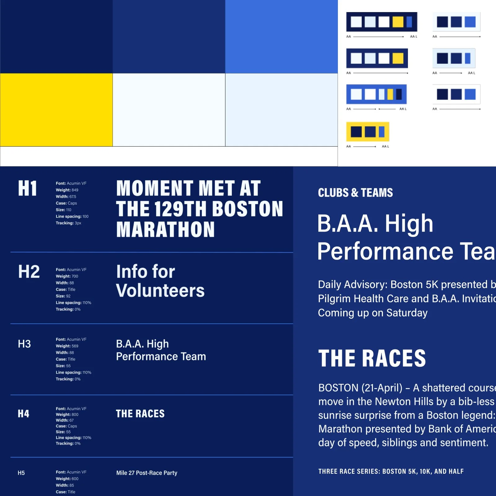
The Problem: B.A.A. in the running community has a very distinct and recognizable brand. The iconic blue and yellow are deeply intwined with their public-facing identity, but how the brand showed up across their materials felt mismatched and lacked the vibrant personality that the organization is known for. For typography, the B.A.A. team had started taking a flavor-of-the-week approach to all non-web content, mixing and matching fonts depending on the content. The challenge was to rethink how the brand could evolve without changing or diminishing the core brand and providing the team with a font system that functions across all materials.
The Solution: Pulling in tints and shades to add depth and variety while maintaining the integrity of the brand allowed us to bring a new life to an iconic brand. The refresh tweaks to the B.A.A. brand still feel true to B.A.A. but allow for a more functional, accessible and interesting execution across their site. The type system embraces a robust font family that had both a wide range of weights as well as widths to ensure ultimate flexibility within the hierarchy.
Pump up the volume.
Aiming to capture the energy, vibrancy and elements of race day (which, if you haven’t been to Boston on Marathon Day it truly is a magical day throughout the entire city) the refreshed brand, design system and content pump up the volume.
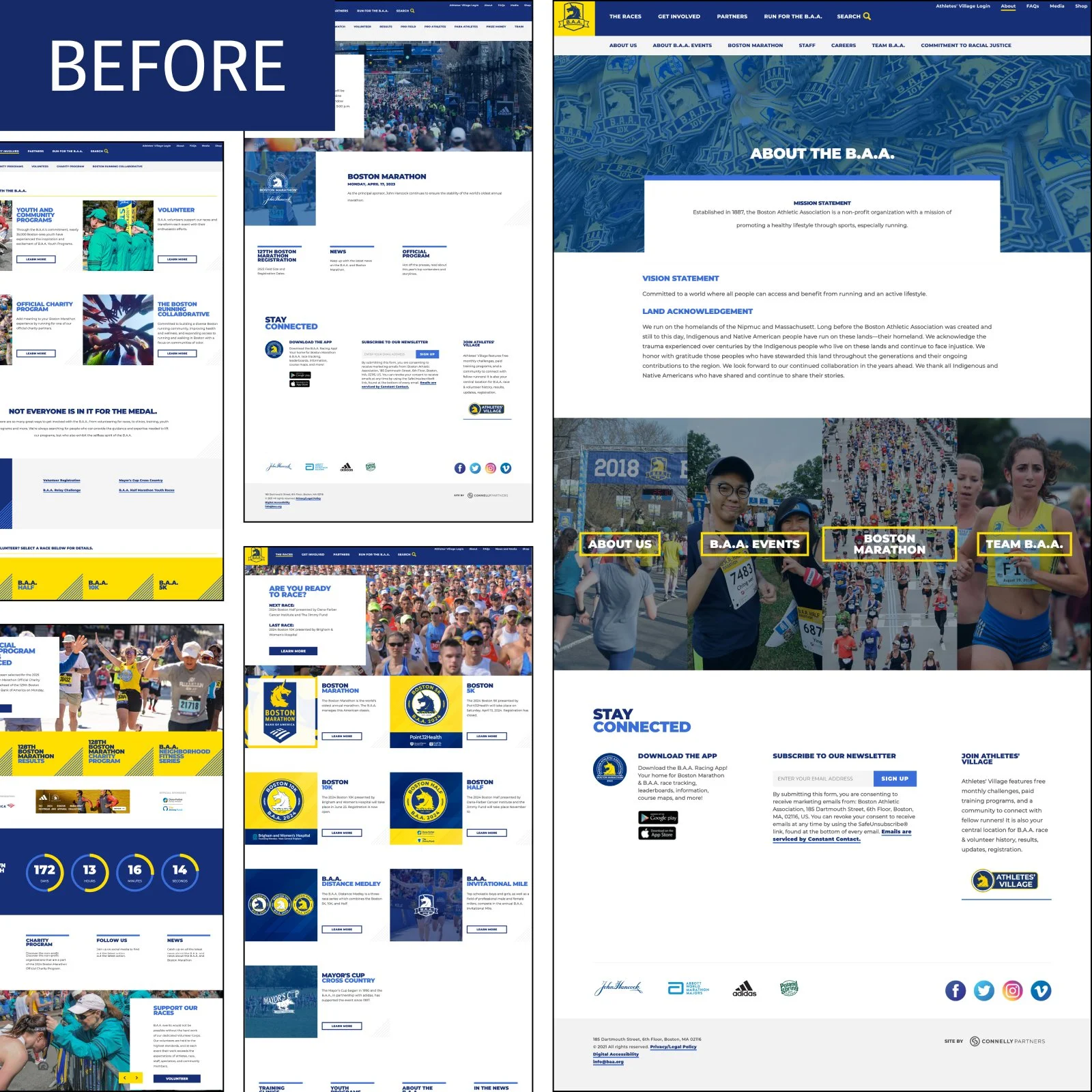
The brand refresh was born out of needing more depth and variety for a site as large as BAA’s, but the new site needed to also address the team’s complaints about the existing site not feeling “them”. The lack of color, photography, and anything uniquely B.A.A. left the site feeling like a pale representation of all of the incredible work the organization does.
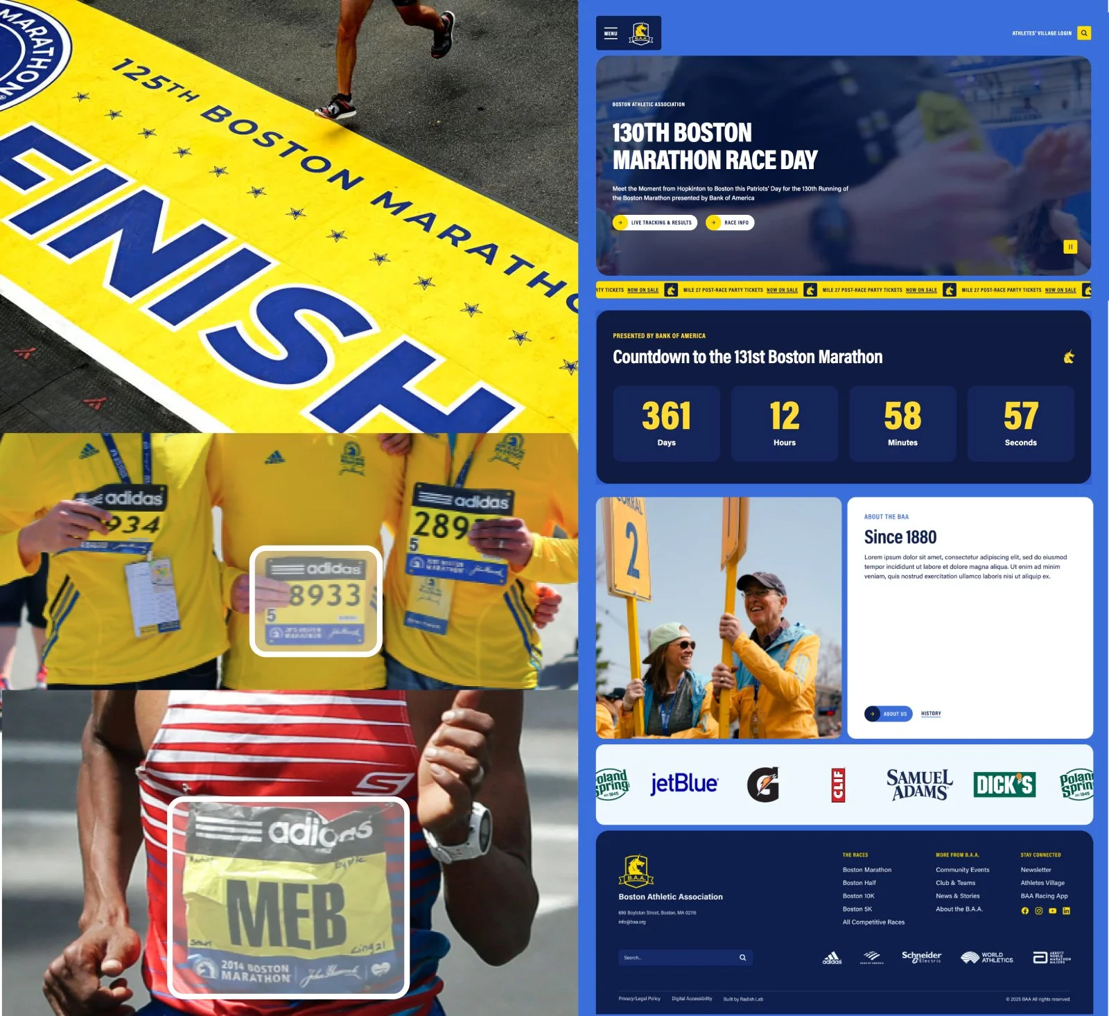
Take color and run with it.
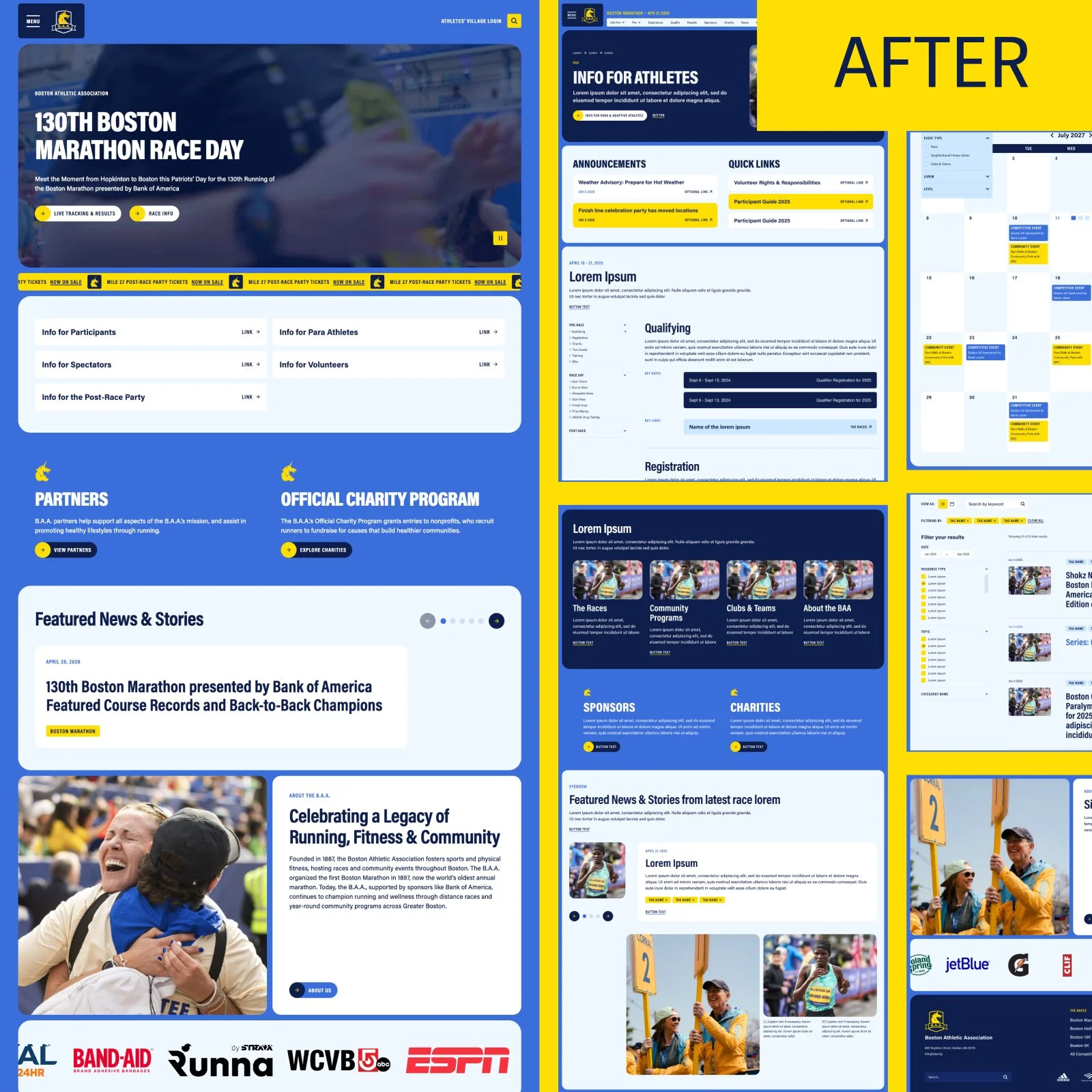
As a total 180-degree shift from the sterile, overly white old experience, the new site embraces color at full volume. The vibrant B.A.A. blue paired with the new rich dark blue tint are layered throughout the design system, bringing add Utilizing the iconic finish-line-yellow as active states, banners and highlights to contrast the layered blue tones. The new tints show up throughout the experience as the user gets deeper into the experience where the information-dense pages live to avoid the overly-white experience the old site had without compromising on legibility.
An iconic element.
Taking the race day inspiration a layer deeper, we introduced a key UI pattern throughout the experience inspired by the shape of each runner’s bib: the rounded corner container. Every block utilizes that iconic shape as the base element, when stacked to form a fleshed out page the collection of bib-containers aim to bring the feeling of being in the middle of the pack on race day.
A User-Focused Experience
The Problems:
A Marathon-Sized Site. At 90+ unique pages, not counting migrated or post content, this site needed an incredibly well defined information architecture system to feel manageable to users.
A Lot to Navigate. Part of what contributed to the sheer volume of pages is the fact that B.A.A. does it all. They operate as a nonprofit organization, produce 6 major races annually, coordinate community events and running groups, publish stories and have 130 years of history, creating a lot of competing user priorities.
61% Mobile. Robust navigations that needed to be just as good, if not better, on mobile without losing any information
The Solution:
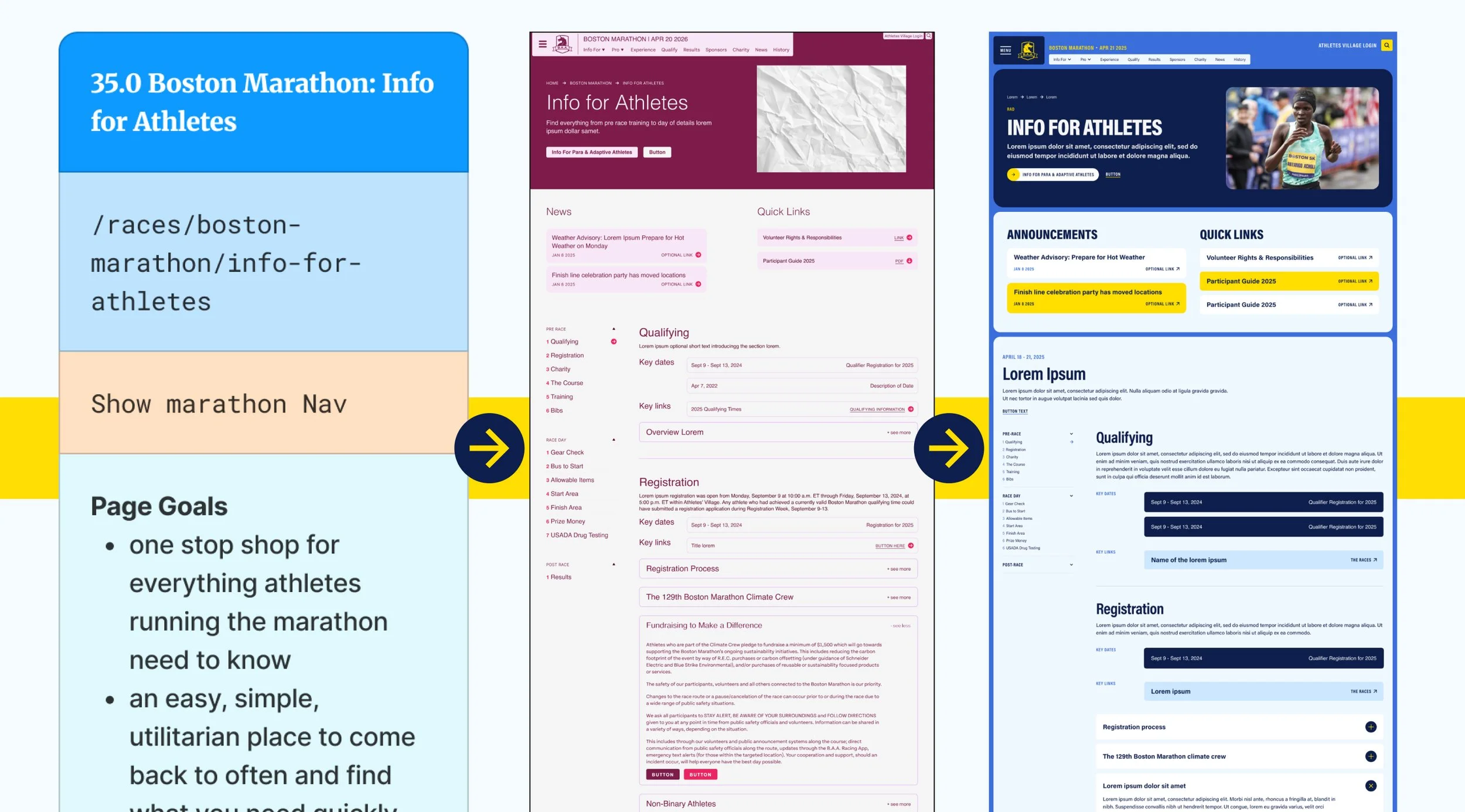
Dual Navigations. Separating the site into two buckets, Organization High-Level and Race Specifics, allowed the site to function The mega-menu approach enabled all organization-level information to be easily accessible, including direct links to all major races. Housing the secondary navigation within the race pages meant the mega menu didn’t have to be multiple shelfs deep and allowed users to more quickly find the specific information they needed. With the Race-level navigations, flexibility was key. Each race has different information available, often adding or removing sections depending on the time of year (i.e. pre-Marathon looks different than Marathon Day than Registration).
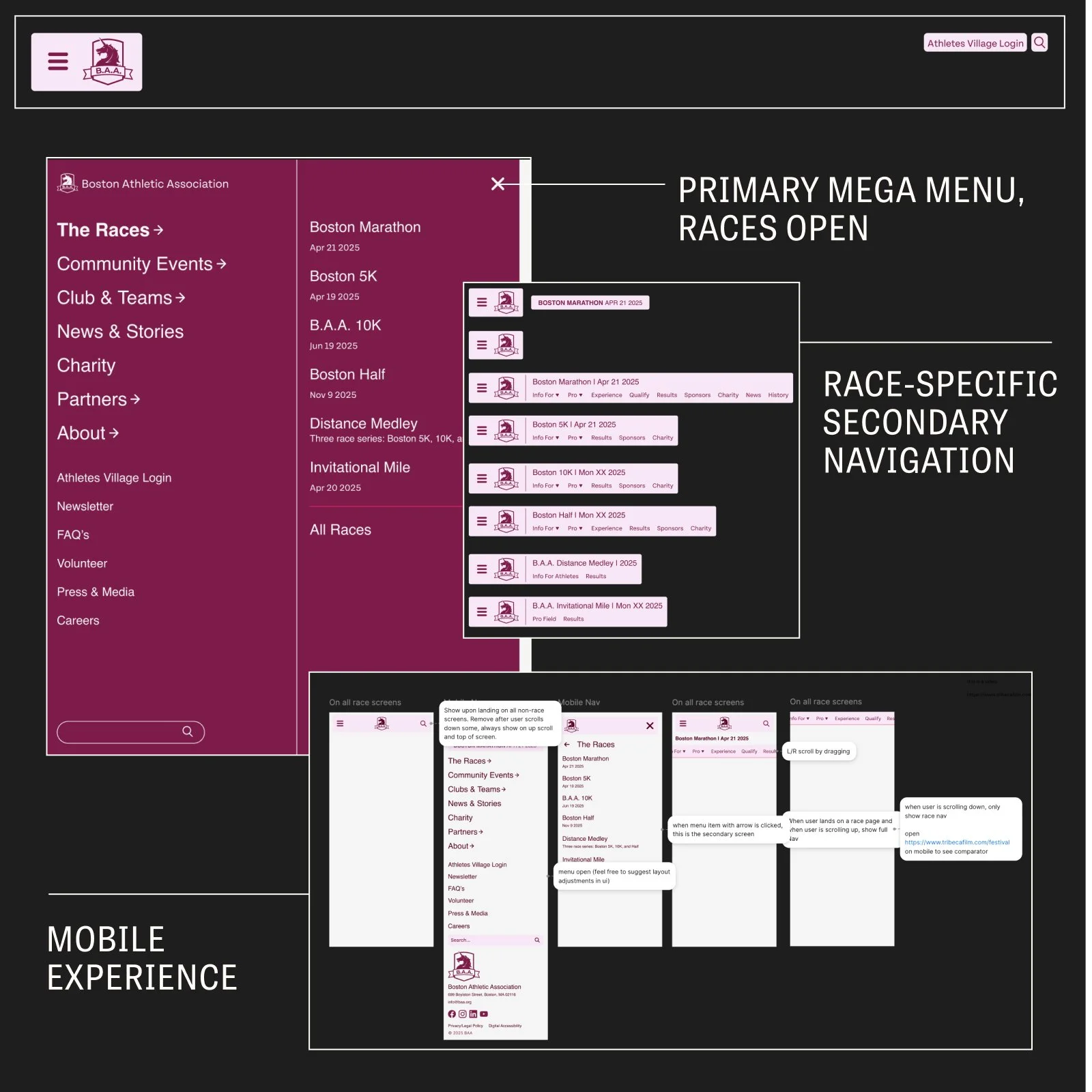
Choose-your-own (race) adventure.
As Design Director, I was involved in the project from start to finish–from the initial proposal and pitch thru to quality assurance and launch, and the entire design process in between.
Design Direction of: Sitemap, Wireframes, Branding*, User Interface, Quality Assurance
*For branding, I was also the Lead Brand Designer
Explore More
-
![]()
Furman Center
Design Direction & Branding
Design Director, Lead Brand Designer
Website Design, Branding -
![]()
Denver Preschool Program
Design Direction & Brand Refresh
Design Director, Lead Brand Designer
Website Design, Branding -
![]()
Nonprofit Association of Oregon
Design Direction & Branding
Design Director, Lead Brand Designer
Website Design, Branding -
![]()
California Certified Organic Farmers
Design Direction & Refreshed Branding
Design Director, Lead Brand Designer
Website Design, Branding -
![]()
Reimagine Public Health
Campaign Design & Strategy
Lead Designer
Campaign Design, Strategy, Branding, Animation, Website Design -
![]()
Public Health Power Hour
Brand Design & Animation
Lead Designer
Branding, Animation, Social -
![]()
Rise + Vote
Campaign Design
Lead Designer
Campaign Design, Branding -
![]()
Marshall Plan for Moms
Campaign Design & New York Times/Washington Post Ads
Lead Designer
Campaign Design -
![]()
HLW
Design Direction
Design Director, Lead Brand Designer
Website Design -
![]()
New York Community Trust
Design Direction
Design Director, Lead Brand Designer
Website Design -
![]()
Community Change Action
Design Direction
Design Director, Lead Brand Designer
Website Design -
![]()
Olmsted Parks Conservancy
Design Direction & Refreshed Branding
Design Director, Lead Brand Designer
Website Design, Branding