Process Highlight
An Accessible Approach to Building Brands
During my time as Design Director at Radish Lab, I lead design across over 40 website projects for NGOs, foundations, and purpose-driven organizations. While a handful had the budgets to fund both a new website and a new brand, many fight for every penny and can’t afford a full rebrand. For each of those clients, I lead a collaborative process of refreshing their existing brands with a digital-first, accessibility-prioritized lens.
Good branding means good branding for everyone
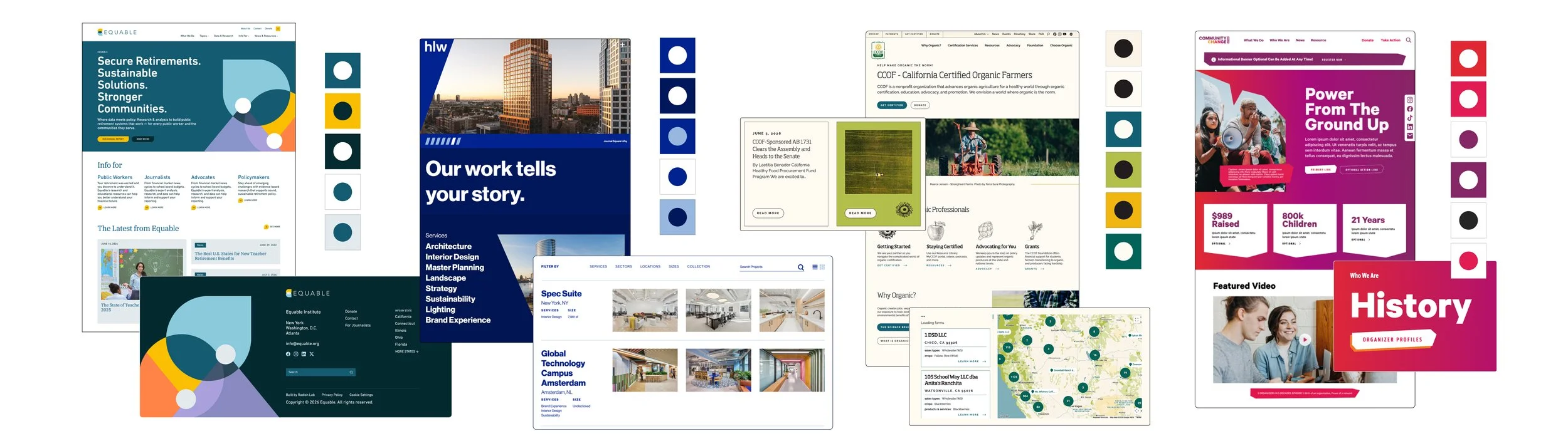
For many nonprofits and impact organizations, creative and branding have never been prioritized line-items in their budgets. But branding is integral to successful storytelling–especially in this digital age. For clients that couldn’t afford full rebrands, I lead the “refresh” approach: the existing brand, just fresher, more usable, and–most importantly–accessible*. Below are a few snippets to showcase the before and after of accessibility focused, digital-first brand refreshes.
*Successful accessibility/WCAG compliance requires more than just color contrast and type sizes, each website build ensured AA WCAG compliance outside of the execution of the branding.
Equable
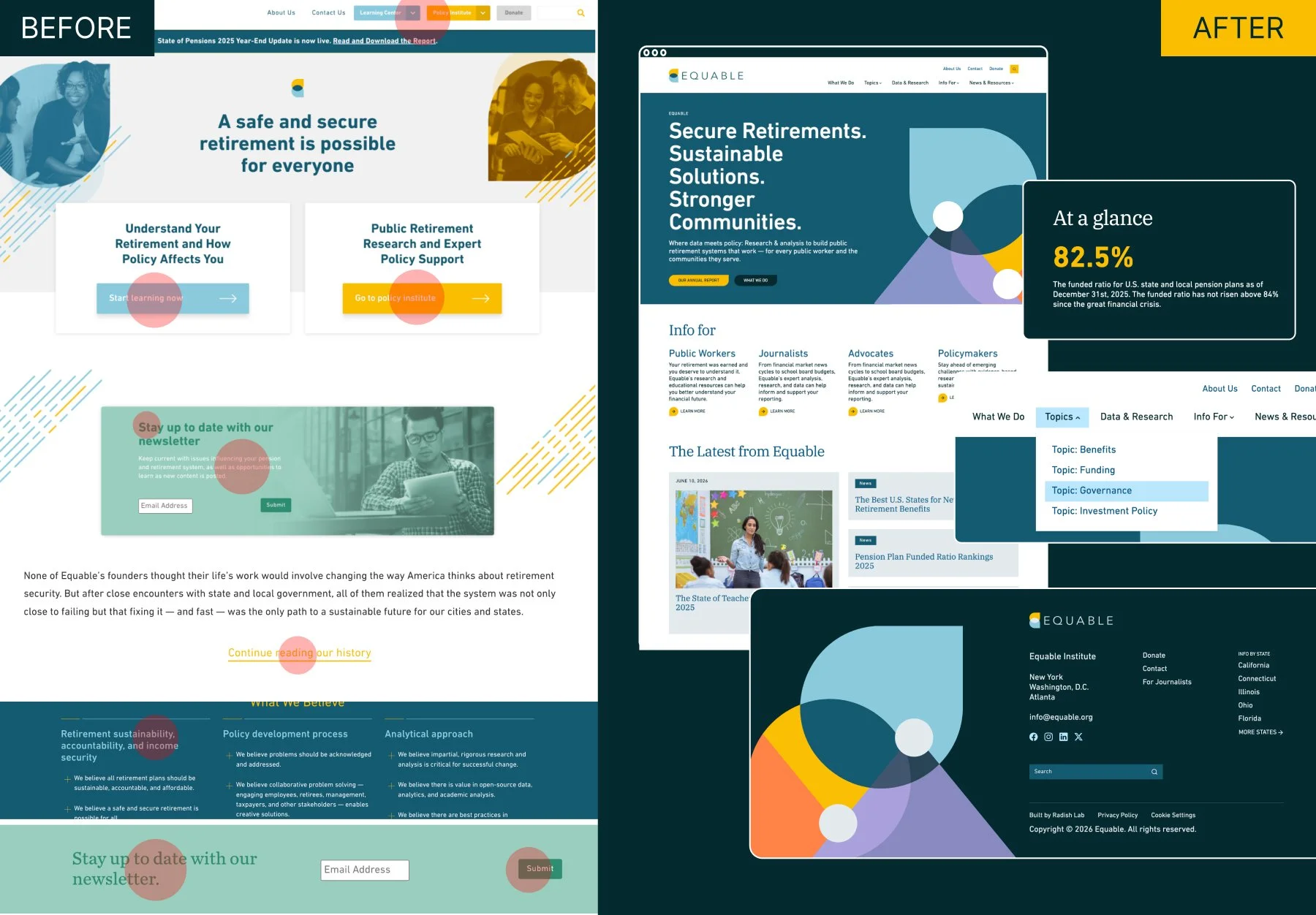
Equable–a research based organization working in pensions and retirement funds–kicked off their website overhaul with a brand they felt was strong, but the execution was not working for them. Their work is data-heavy and on the more serious side, but they wanted to make sure their brand felt approachable.
With that in mind, the Refresh focused on taking a very wide palette and narrowing in on accessible combinations, exploring how color can be used consistently without feeling overly playful and honing in on strong, simple layouts to balance their brand and their narrative.
Primary combinations moved away from light, bright colors paired with white text and instead leveraged the rich teals as backgrounds with pops of yellow + teal text to ensure legibility.
TEDMED
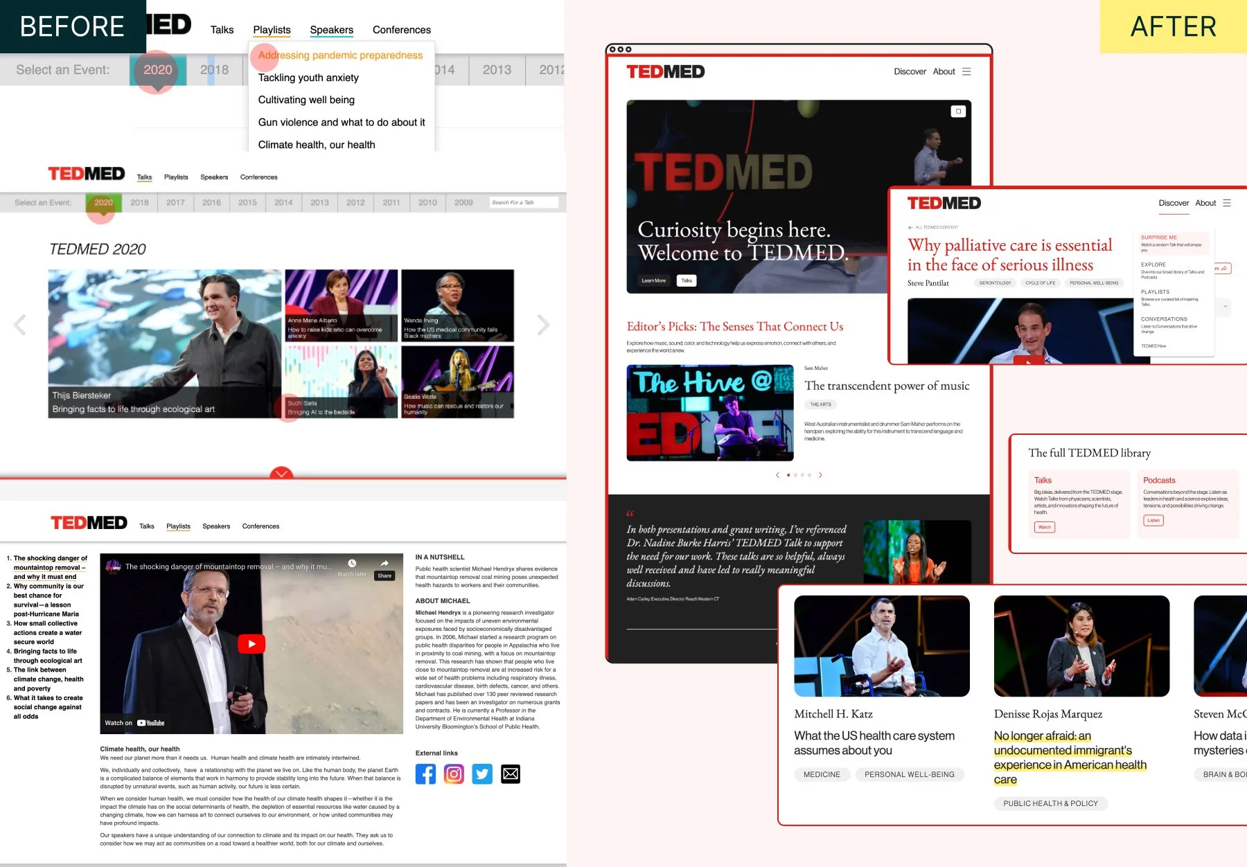
TEDMED is an organization focusing on making health and medical research, discoveries and policy accessible for everyone. Their brand came with some fuzzy guidelines around when they must use their affiliate parent brand TED’s branding versus where their affiliate-not-subbrand status allowed them flexibility and freedom to expand.
The main objective was to explore how TEDMED can emphasize their connection to TED and their household name recognition while establishing a distinct TEDMED aesthetic that they can own for years to come.
The final product embraces the core components of the TED brand–clean sans serif, and a core palette of red, white and black–but adds elements that feel distinctly TEDMED. In place of the TED secondary colors that were not accessible, a soft pink and vibrant highlighter-yellow were incorporated to add subtle background variations and fun pops. A strong academic serif comes in to compliment the simple TED sans, leaning in to TEDMED’s research-based content.
HLW Architects
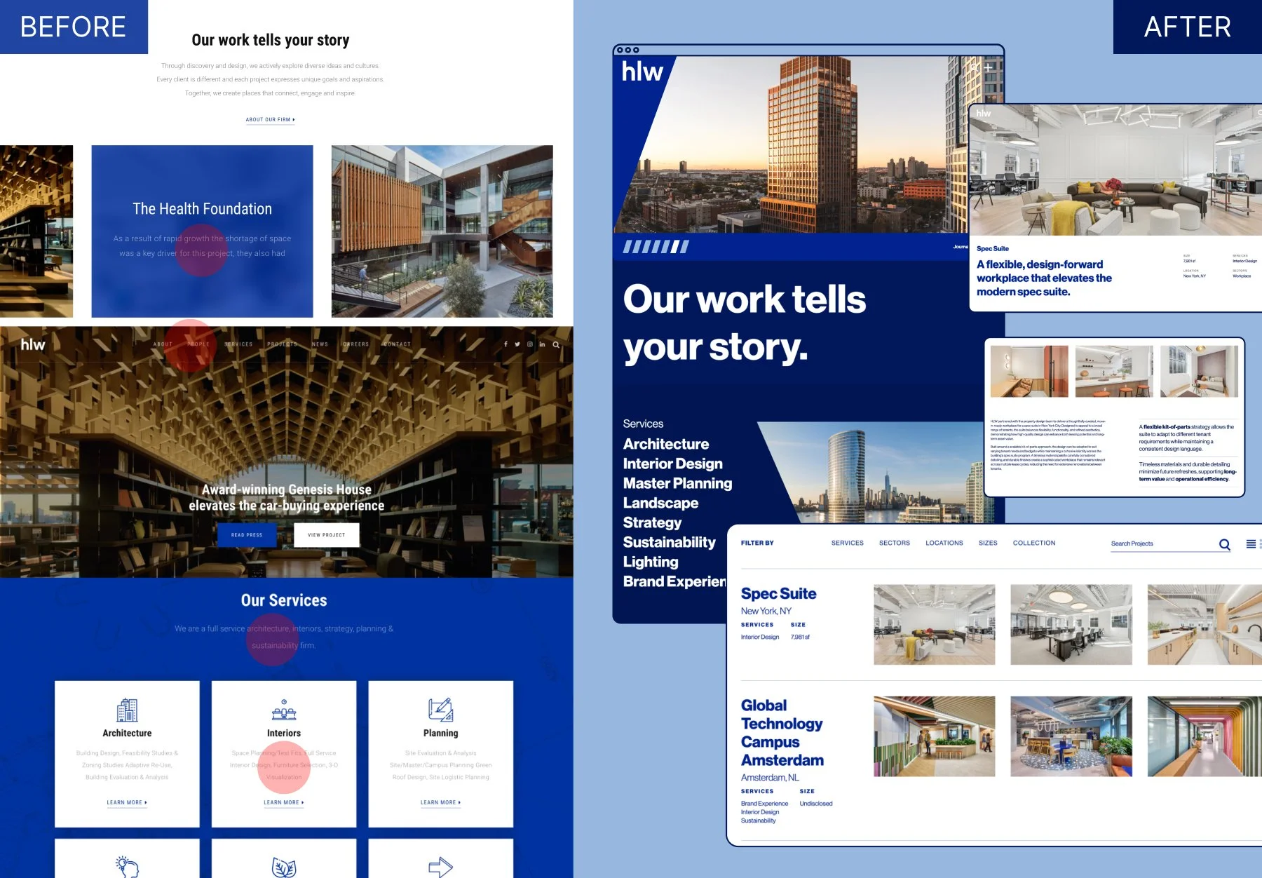
HLW is a predominant global architecture firm that entered into a major website overhaul confident the bones of their brand were strong but needed support on how to elevate their minimal aesthetic to feel crisp, clean and contemporary.
The existing site’s usage of their brand was a mixed bag from a WCAG compliance standpoint. Small, thin text, low-contrast text on white, and text overlay were the main accessibility concerns that needed to be addressed in execution. Otherwise, the main challenge was to maintain their very limited palette and rework how it’s used in a way that felt authentic to their 140 year old brand while feeling fresh and dynamic.
For the Refresh, the focus became emphasizing HLW’s bold, innovative architecture aesthetic through large type and bold high-contrast usage of their blues – introducing a rich navy to contrast the primary cobalt-blue and provide a background color that could read more neutral than the primary blue ever could, creating a more flexible design system for their site.
In my capacity as Design Director, I was responsible for writing and managing the production of all case studies. To read more about the process for this project, check out the official Radish Lab case study here.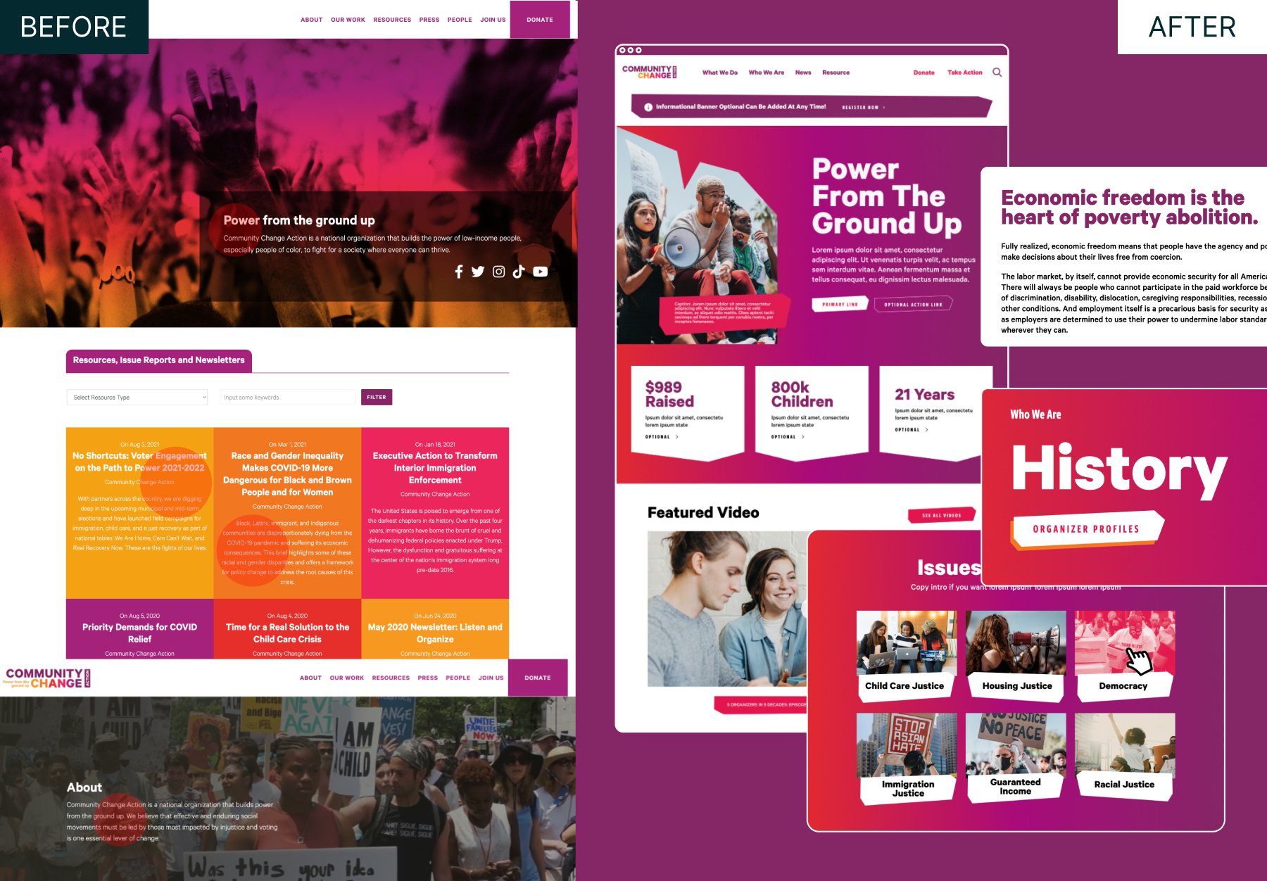
Community Change Action
Community Change Action is a is a national organization that builds the power of low-income people, especially people of color, to create a multiracial democracy and a fair economy where everyone can thrive. Their existing brand embraced vibrant colors and did not shy away from using them, but the team still felt like the execution wasn’t living up to the work that they do.
Redesigning their brand was not a part of the project scope but rethinking how it could be applied was a critical success metric. WCAG compliance became the foundation for tweaks and adjustments to their bright palette, requiring only minor tonal adjustments to allow for adequate contrast. From there, it was a matter of visually matching the volume and energy their work has on the communities they serve.
The final product of the Refresh has no shyness around color usage or bold typography. Embracing the collective spirit of grassroots action, the site serves as a visual reminder that the work of the community can be loud and proud, not fitting into perfect boxes.
In my capacity as Design Director, I was responsible for writing and managing the production of all case studies. To read more about the process for this project, check out the official Radish Lab case study here.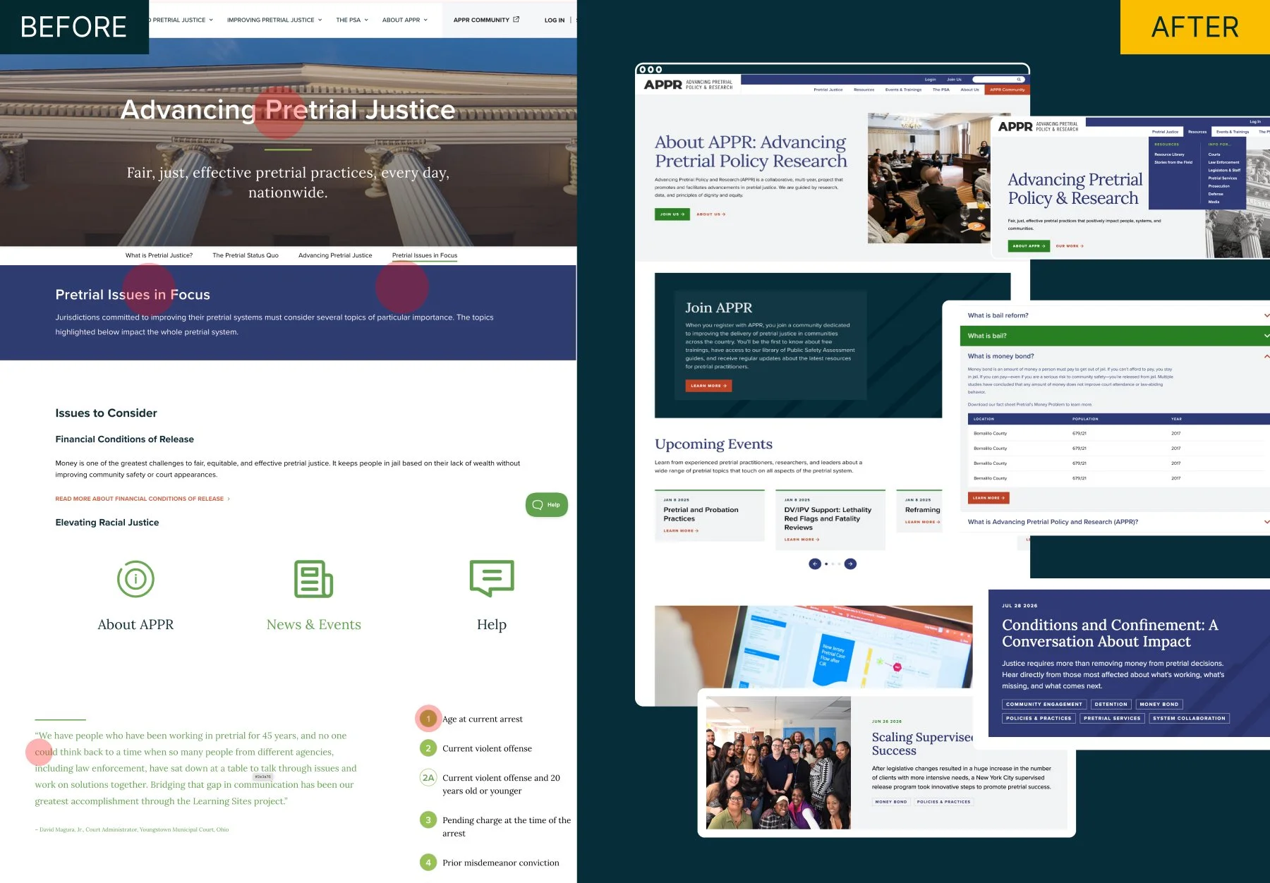
Advancing Pretrial Policy & Research (APPR)
Advancing Pretrial Policy and Research (APPR) is a collaborative, multi-year project that promotes and facilitates advancements in pretrial justice. The existing brand felt connected to APPR’s parent organizations, but when they entered into the process of rebuilding their website it became clear that their brand needed work for them to successfully stand alone.
A rebrand was not financially possible within their scope and budget, so a Refresh became the chosen path for updating and enhancing the brand. Maintaining their core palette with minimal modifications to the values themselves, the Refresh focused on changing how color was utilized. Shifting to richer, darker tones for primary backgrounds and moving the vibrant greens from primary status to supporting status.
Layering in tonal patterns to add visual depth to the experience given the lack of photography helped to compliment the clean and easy-to-navigate aesthetic needed to support their content.
California Certified Organic Farming (CCOF)
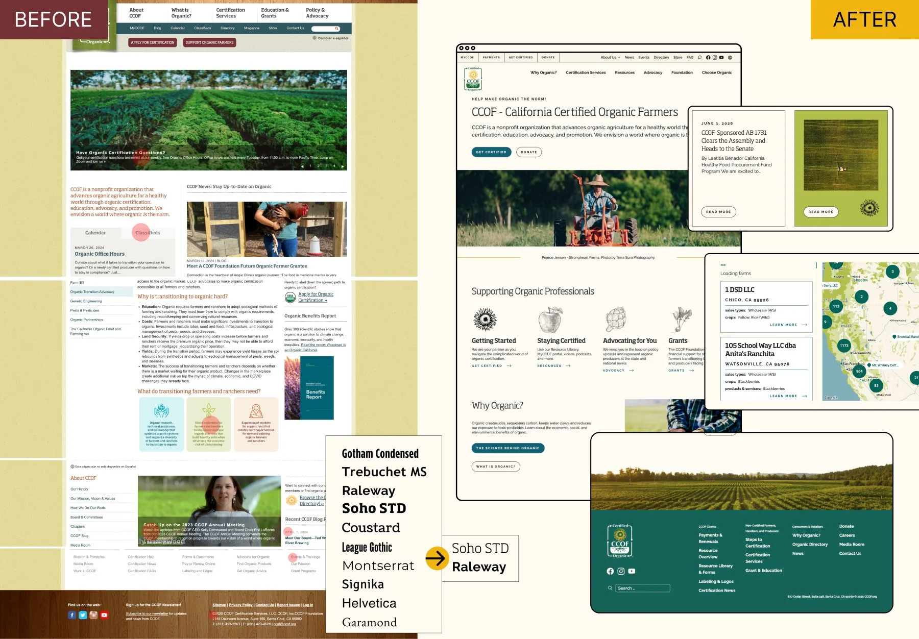
California Certified Organic Farming (CCOF) is a nonprofit organization that advances organic agriculture for a healthy world through organic certification, education, advocacy, and promotion. At the outset of their website project, they had a robust and well documented brand, but it had grown in all directions. With over 10 fonts and 10 colors without clear, easy to follow rules on how to use them, the execution was often failing WCAG compliance standards.
Maintaining the integrity of their existing brand was important to the CCOF team, so rather than exploring new fonts the focus pivoted to which of the existing list were most functional without sacrificing personality. The color palette edited out any colors that were too challenging or restrictive to use from a WCAG compliance lens, leaving them with rich teals, bright greens, and a pop of sunny yellow to play with. The end result aimed to be a “breath of fresh air” for both the internal team managing the brand and users of the site.
In my capacity as Design Director, I was responsible for writing and managing the production of all case studies. To read more about the process for this project, check out the official Radish Lab case study here.Explore More
-
![]()
Denver Preschool Program
Design Direction & Brand Refresh
Design Director | A Radish Lab Project
Website Design, Branding -
![]()
MenCare
Design Direction & Branding
Design Director | A Radish Lab Project
Website Design, Branding -
![]()
Nonprofit Association of Oregon
Design Direction & Branding
Design Director | A Radish Lab Project
Website Design, Branding -
![]()
California Certified Organic Farmers
Design Direction & Refreshed Branding
Design Director | A Radish Lab Project
Website Design, Branding -
![]()
Public Health Power Hour
Brand Design & Animation
Lead Designer
Branding, Animation, Social -
![]()
Rise + Vote
Campaign Design
Lead Designer
Campaign Design, Branding -
![]()
Marshall Plan for Moms
Campaign Design & New York Times/Washington Post Ads
Lead Designer
Campaign Design